Choosing Balloon Colours is an exercise in balance. A dominant shade establishes the identity, a supporting colour gives it room and an accent draws attention to a particular detail. The room contributes its own colours through walls, lighting and furniture. This guide uses the photographed arrangements to explain how a palette works as a whole, rather than presenting a list of fashionable shades.
Balloon Colours: turn a colour preference into a decorator's brief
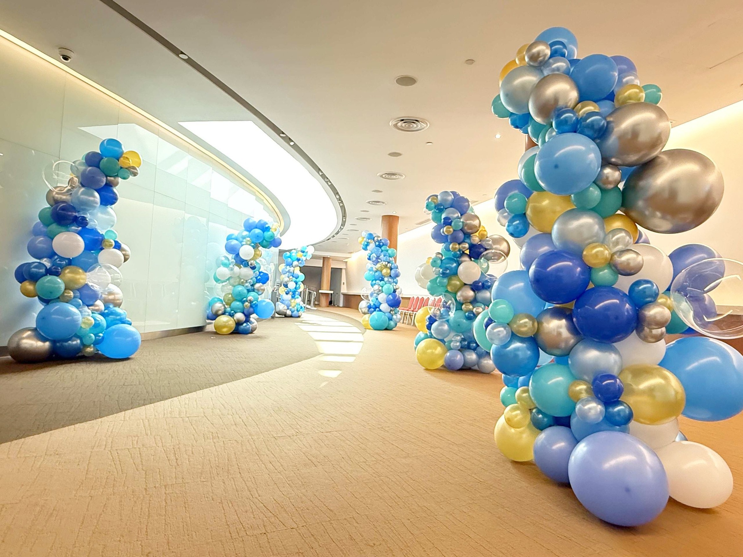
'Blue and gold' leaves several decisions unresolved: which colour leads, whether the blue is soft or vivid and where the metallic finish appears. A more useful description is 'mainly blue, with white for separation and small gold accents'. It communicates a relationship between colours without pretending a screen reference is an exact material match.
Review the proposal against a photograph of the actual room. If the venue already has strong colours, decide whether the balloons should blend with them or provide deliberate contrast. Ask to confirm the available shades and finishes before approving artwork that depends on a specific colour combination.
Write a short sentence for your decorator: “Mostly blue, with white to keep it light and gold as an accent.” This is more actionable than a folder of unrelated references. You can then compare how the same palette would appear in balloon pillar decorations at an entrance or beside a welcome sign.
Decide whether soft or vivid shades suit the setting
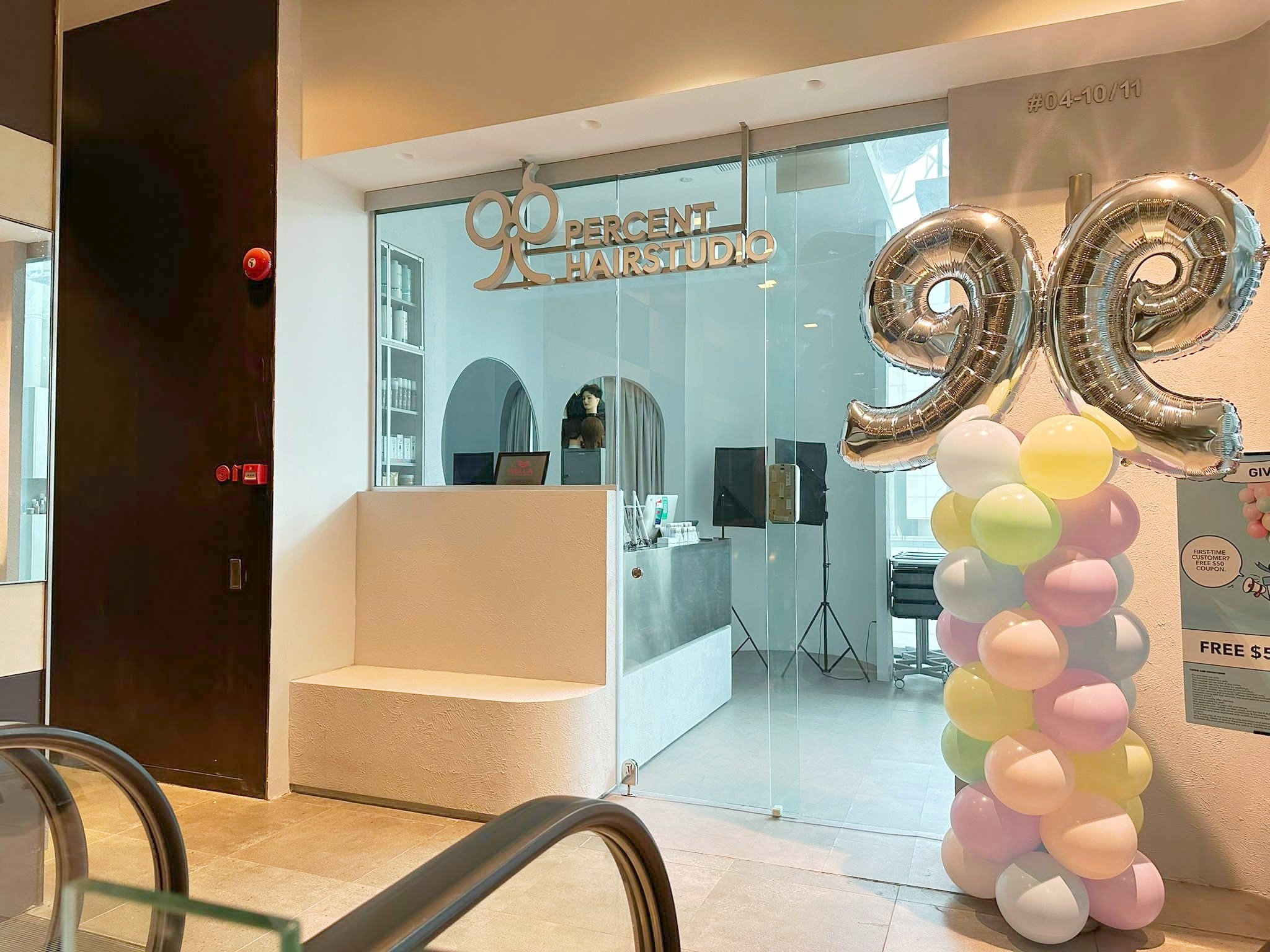
Pastel Balloon Colours can work well in a calm reception area because they add colour without overwhelming the surroundings. The salon example combines pale pink, yellow, mint and lilac with a silver scissors topper. The recognisable topper gives the display a purpose; the softer shades keep the doorway welcoming.
Vivid shades make a different statement. Strong red, blue or yellow can stand apart from a neutral wall and suit a lively launch or celebration. Neither approach is automatically better. The right choice depends on how much visual energy the room already contains and what else guests will see beside the balloons.
Compare references at a similar scale. A close photograph of one pastel cluster may look very different from a complete doorway. Ask to see the combination beside the intended sign or artwork, and note whether the room uses warm timber, cool glass or colourful flooring. Those existing surfaces form part of the finished palette too.
Let the occasion guide your accent colour
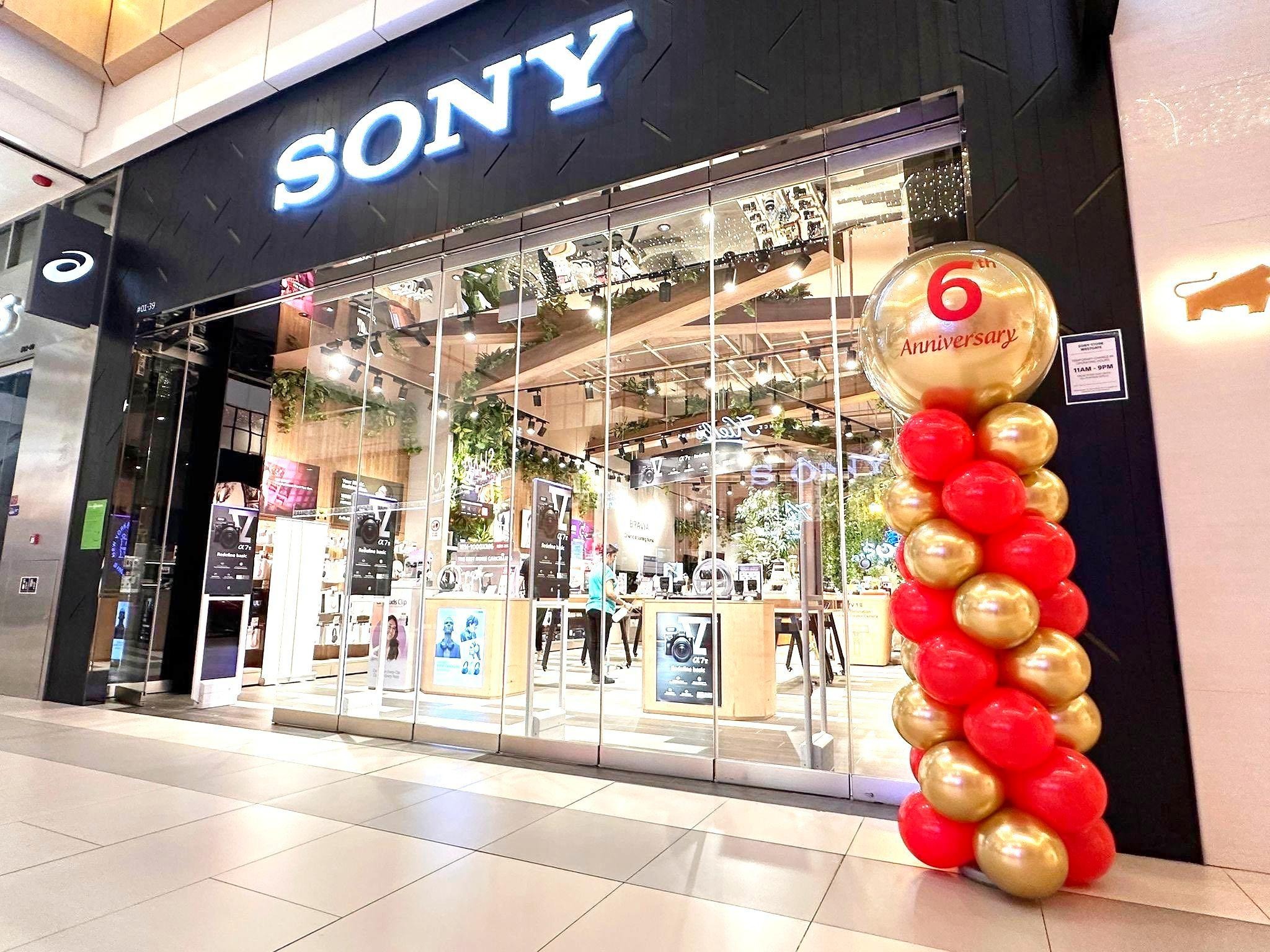
An accent should connect to the celebration instead of appearing as an afterthought. Red and gold can give a store anniversary a clear festive character, especially when the printed topper repeats the same colours. In this example, the anniversary message remains the focal point while the balloon column carries its colours down to floor level.
If your campaign artwork already uses several bright shades, choose the one or two that matter most. Adding every logo colour to a small arrangement can make the overall message harder to read. A simpler supporting palette gives the printed information room to stand out.
Before approving Balloon Colours, compare the event name, logo and accent together. Ask whether the accent is meant to appear throughout the display or only in a few larger balloons. This small distinction changes the effect considerably and helps keep the decorator’s interpretation aligned with your brief.
Balance metallic finishes with quieter tones
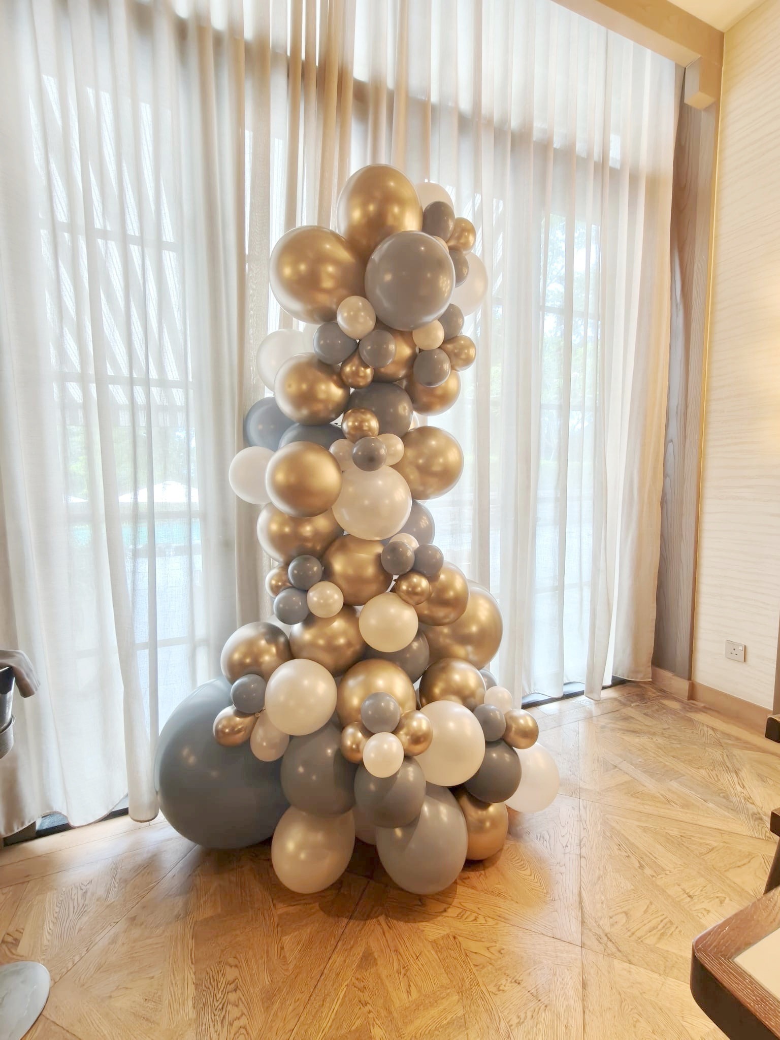
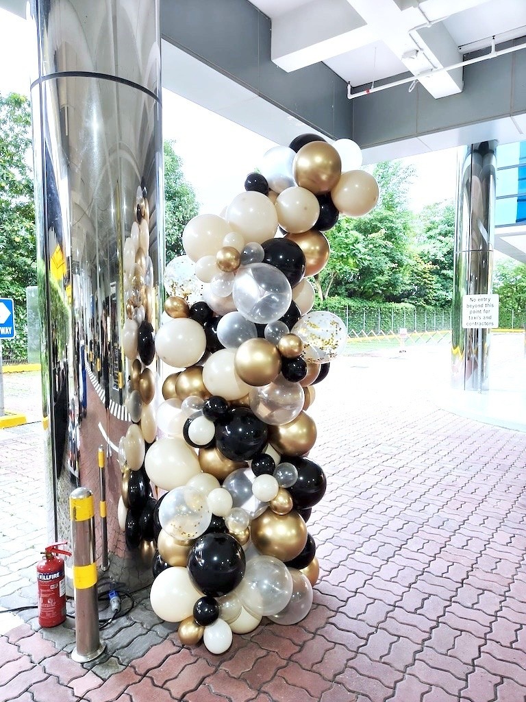
Gold and silver finishes catch attention, but they do not need to fill the entire arrangement. The gold, grey and white example uses a mix of sizes and tones to create variation. Grey gives the eye a quieter place to rest, while the metallic balloons provide highlights.
Look at finishes as well as colour names. A shiny gold balloon and a muted gold tone will not read identically in a photograph. Similarly, a dark colour beside a bright window may look different from the same shade against a curtain. Share a photo of the actual location, especially if the display will sit in direct daylight or under warm indoor lights.
You can browse THAT Balloons’ balloon backdrop and wall decorations for examples of how combinations extend into larger arrangements. Use references to explain the balance you like, then have your chosen decorator confirm available shades and finishes for your event date.
Use colour blocks when the theme is playful
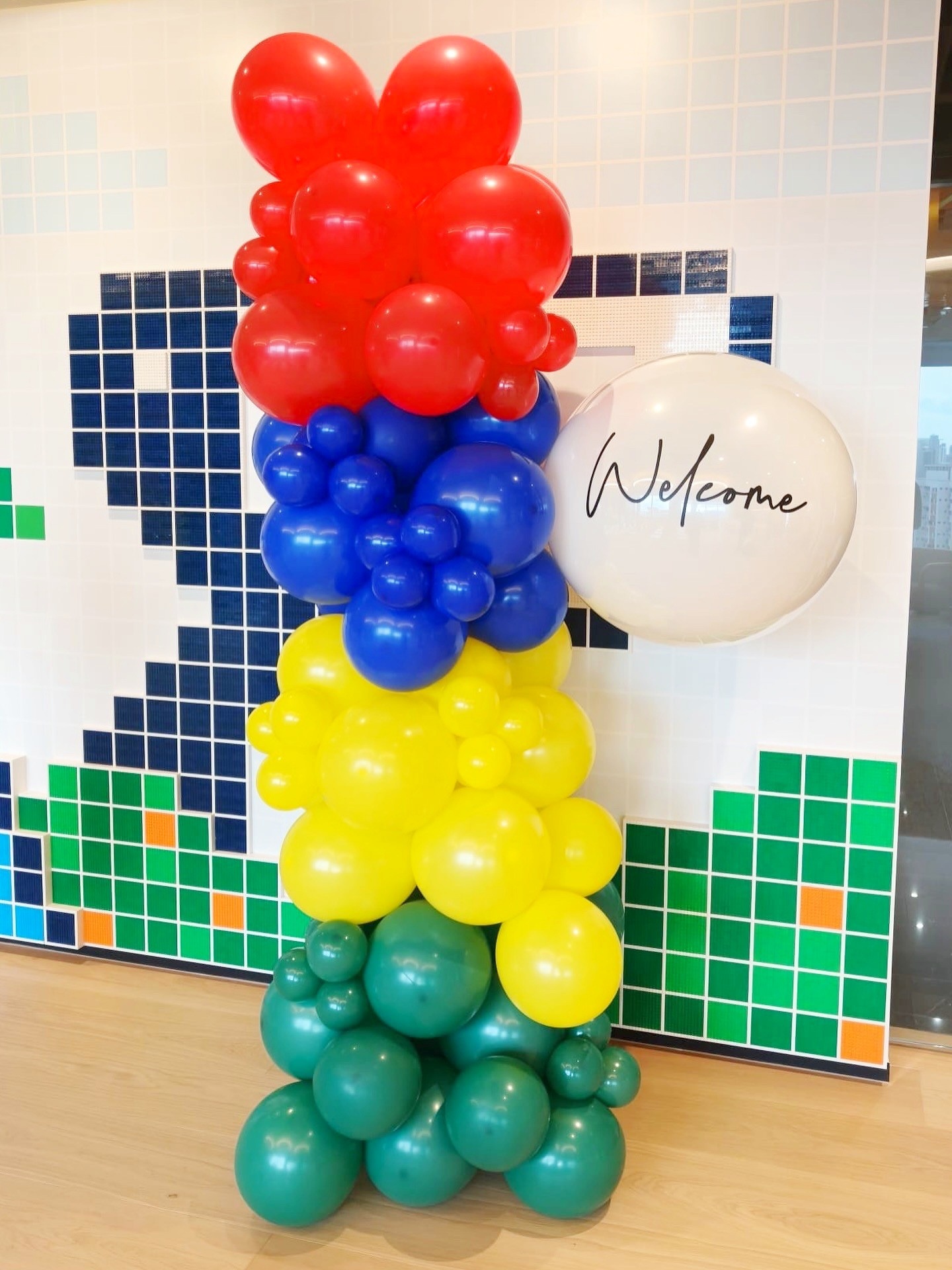
A multicolour display can still feel organised. In the welcome arrangement pictured below, red, blue, yellow and green appear in distinct sections. That structure makes the combination easy to understand even though it includes several strong colours. The white welcome circle provides a clear place for the message.
This approach is useful when a theme naturally calls for variety. Instead of mixing every shade randomly, discuss whether the design should move through separate bands, repeat a spiral or create a gradual transition. The arrangement of the colours matters as much as the colours themselves.
Keep nearby signage in the conversation. If the backdrop is already patterned, a plain message panel can prevent the scene from becoming too busy. Take a step back when reviewing the proposal: guests should recognise the welcome point and read the main wording without needing to search among the decorations.
Repeat the palette across the event carefully
Once the main combination is agreed, carry it into other decorated points without making every arrangement identical. A showroom welcome cluster, a reception pair and a stage accent can share navy, gold and white while using different proportions. Consistency comes from the relationship between the colours, not from copying one shape everywhere.
For a larger event, discuss stage balloon decorations alongside entrance styling. Show the decorator which areas appear together in photographs. Those areas benefit most from a coordinated palette, while a separate activity corner may have room for a playful variation.
Confirm the final colour list in writing and keep a single approved reference with the event brief. Screen settings and room lighting can change how shades appear, so treat digital images as a guide and ask about physical samples where precise matching matters. Agree any acceptable substitutions before setup rather than leaving that decision to the event morning.

More Balloon Colours to compare
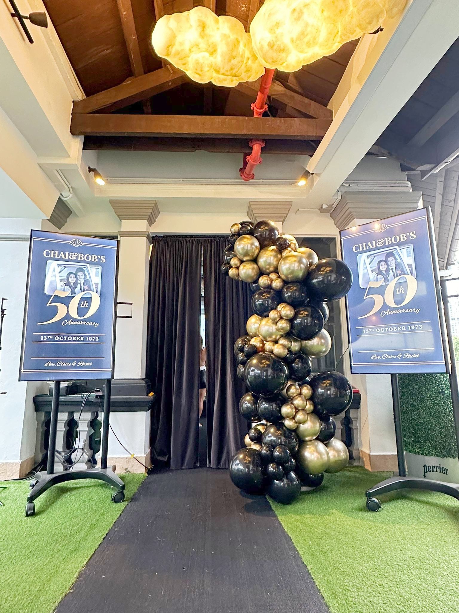
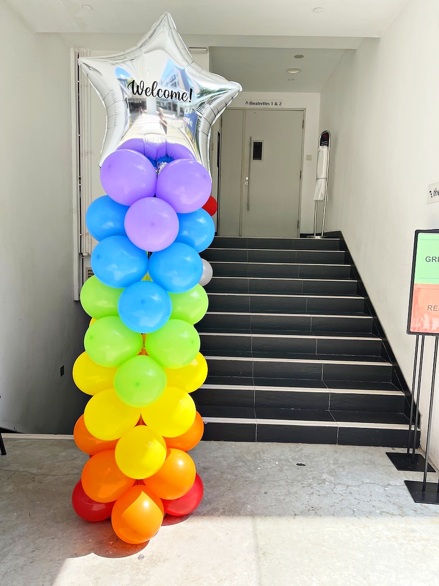
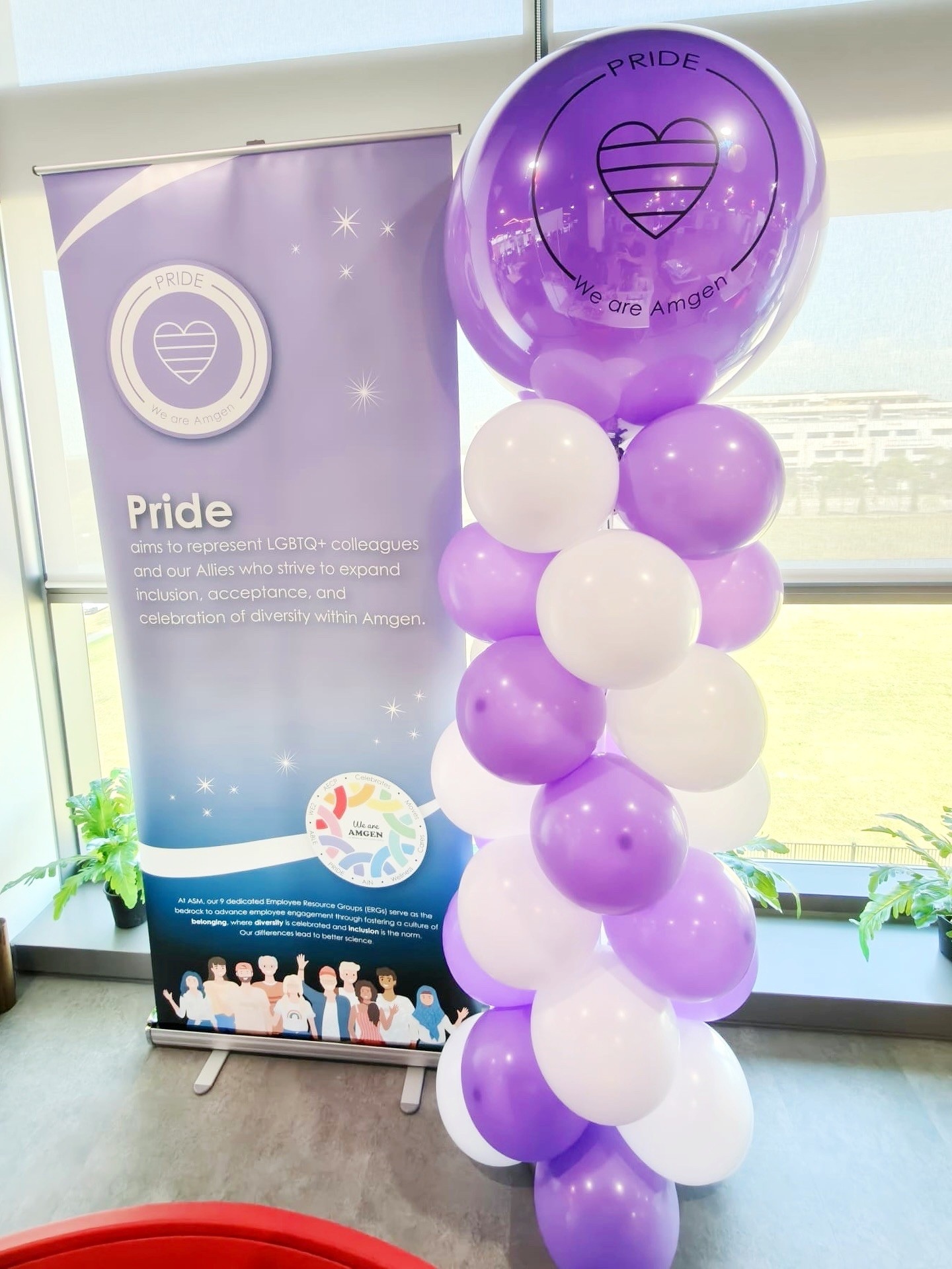
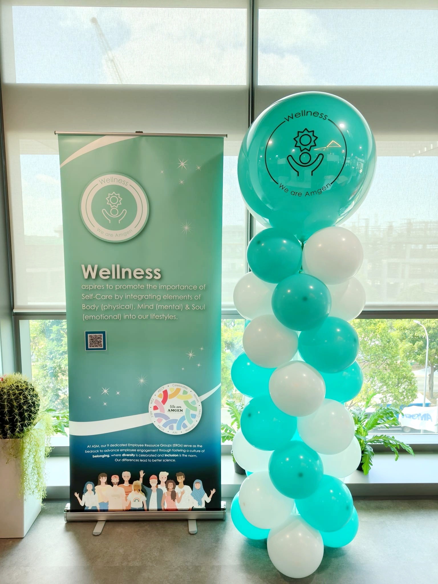
The examples below show how different combinations change the character of a similar display: blue and white, black and gold, a neutral metallic mix, rainbow bands, purple and white, and teal and white. Use them to identify the balance you prefer. A simple two-colour spiral may communicate your idea more clearly than a more elaborate mix.

Build a clear colour brief for your celebration
Send Balloon Shop your event date, venue photographs, preferred colours, brand artwork and the areas you want decorated. Include one main reference and explain what you like about it, whether that is the contrast, the soft tones or the amount of metallic detail. A focused brief makes it easier to develop a coherent proposal. Contact Balloon Shop to discuss a palette and decoration plan for your Singapore event.